
The main goal of redesigning the new game mode selection was to present all game modes on a separate screen compared to the previous dropdown list. Modes should display the main rewards and rules of the game, can have different visual weights, and their number may change depending on the season.
The minimal number of game modes is as follows:

THE GRID
The grid was designed to provide a common usable pattern for item selection, and then it was adapted for the game's main resolution breakpoints.
The grid was designed to provide a common usable pattern for item selection, and then it was adapted for the game's main resolution breakpoints.

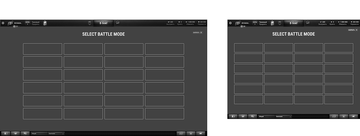
A rule for arranging modes was proposed: From left to right, from larger to smaller.


Then, the usefulness of the game mode card was determined. We defined what information adds value and helps users achieve a specific goal, and which information can be hidden.

During the user tests, we identified another value: some people want to know their progress for different game modes, for example, Battle Pass level or rank in ranked battles. To achieve this, we provided a progression look. It was a toggle button that showed additional information on each game mode card.
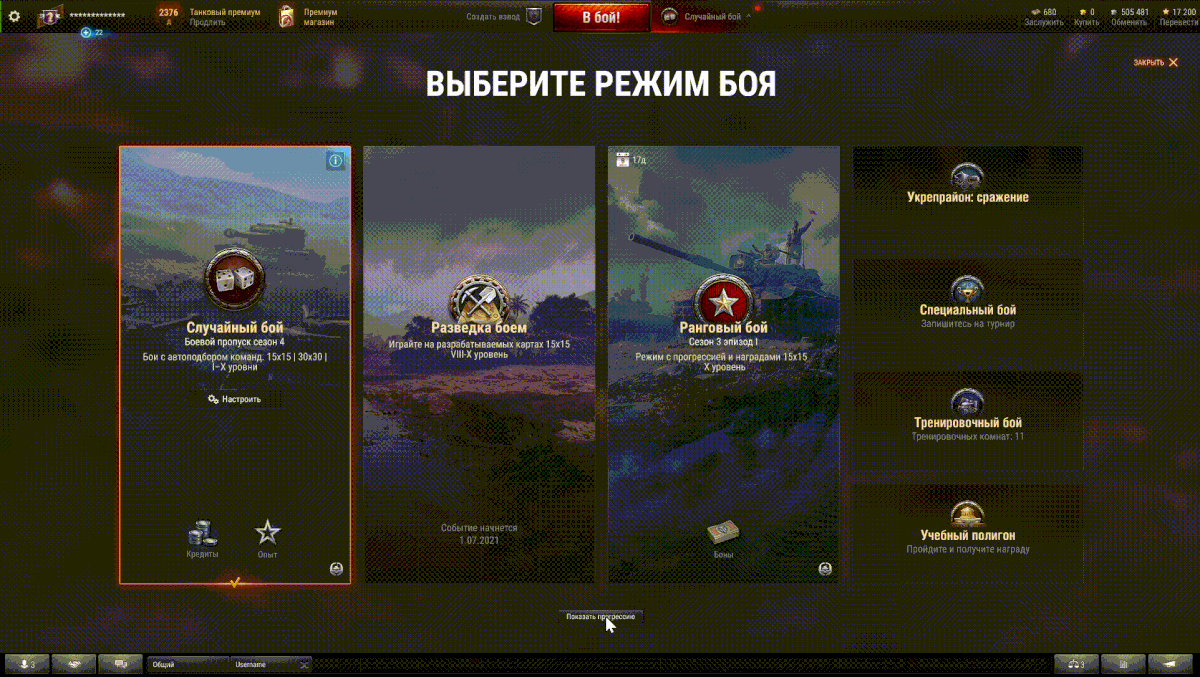
Every game mode card includes an entry point to the info page, so players can find all the additional information, videos, and specific details about each game mode.
The button appears in the hover state or is shown on the selected game mode, and opens a full-screen info page.
The button appears in the hover state or is shown on the selected game mode, and opens a full-screen info page.


